
Chicago Penthouse
This client approached my firm after seeing several architectural and interior design projects we had recently completed for friends and associates. With their children grown, their sizeable residence on Chicago’s north shore was no longer needed. A decision was made to return to city living with easy access to the husband’s downtown office, easy access to the numerous cultural venues the city has to offer and restaurants offering world class cuisine.
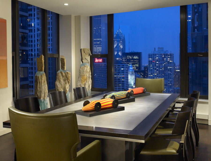
The search began for a residence that would provide the square footage and feel of a single-family house. At the time, there was a 52 floor residential tower under construction in Chicago’s Gold Coast neighborhood. The 42nd floor of the tower provided open space with 5,000 square feet of living space plus two terraces. The floor to ceiling glass allowed for unobstructed views of Lake Michigan to the east and the city to the north and south.
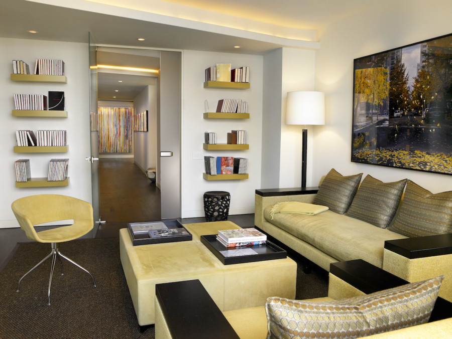
After numerous design development sessions, an open floor plan was arrived at. The “public” rooms were located along the south expanse of the unit allowing for sweeping views of Chicago’s skyline. The “private” spaces, bedroom suites and library were situated along the north expanse of the residence. The core connecting the public and private rooms was planned to provide a connecting gallery for display of the client’s extensive art collection along with closets, storage rooms and a laundry. So as to allow natural light to penetrate the core of the residence, floor to ceiling pivoting glass doors were used throughout. The etched glass provides privacy while the pivots eliminated the need for door casings, maintaining the clean lines and minimalism that were key to the design concept.
The living room and adjoining media area wrap around one of the terraces. Both spaces provide intimate seating groups, while their adjacency allows for larger gatherings. The kitchen and dining function, while open to the living spaces, is screened from view by a partition sheathed in flamed African Green granite. The mica flakes in the granite, when washed with light, shimmer. The same stone was used to face the living room fireplace.
The cook’s kitchen was planned and designed for entertaining. When viewed from the dining area, the appliances are intentionally concealed from view. In keeping with the glass interior doors, upper cabinets and the back splash at the sink are of etched glass as well reiterating the concept of “lightness and transparency.”
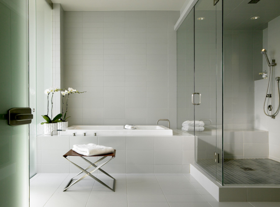
The color palette was arrived at with varying shades of greens and blues, cool tones, used for the “public” rooms with their south and west exposures. For the “private” spaces I introduced a warm palette of vibrant green in the library, vivid gold tones in the master suite and an assortment of red orange colors in the guest suite. Tiles, stones and woods for the custom millwork and plank floors are in tonalities ranging from silver gray to a deep, rich coffee brown, neutral tones that unify and visually anchor the interior and act as a foil for the jewel toned fabrics and carpets.
On most of my projects, I routinely consult with specialists in varying fields. With the continuing advancement in new material development and technology it’s virtually impossible for one to keep pace. From lighting design to “smart house technology” we assemble a team to lend their expertise and contribute to the success of the project.

